QUICKER TO THE CRUNCH
Pringles:
Packaging Re-design
The Ask:
Select a brand's (physical) product and design a unique, improved physical presentation of the product to the customer. Therefore, I decided to create a new packaging design for Pringles to make it more consumer friendly.
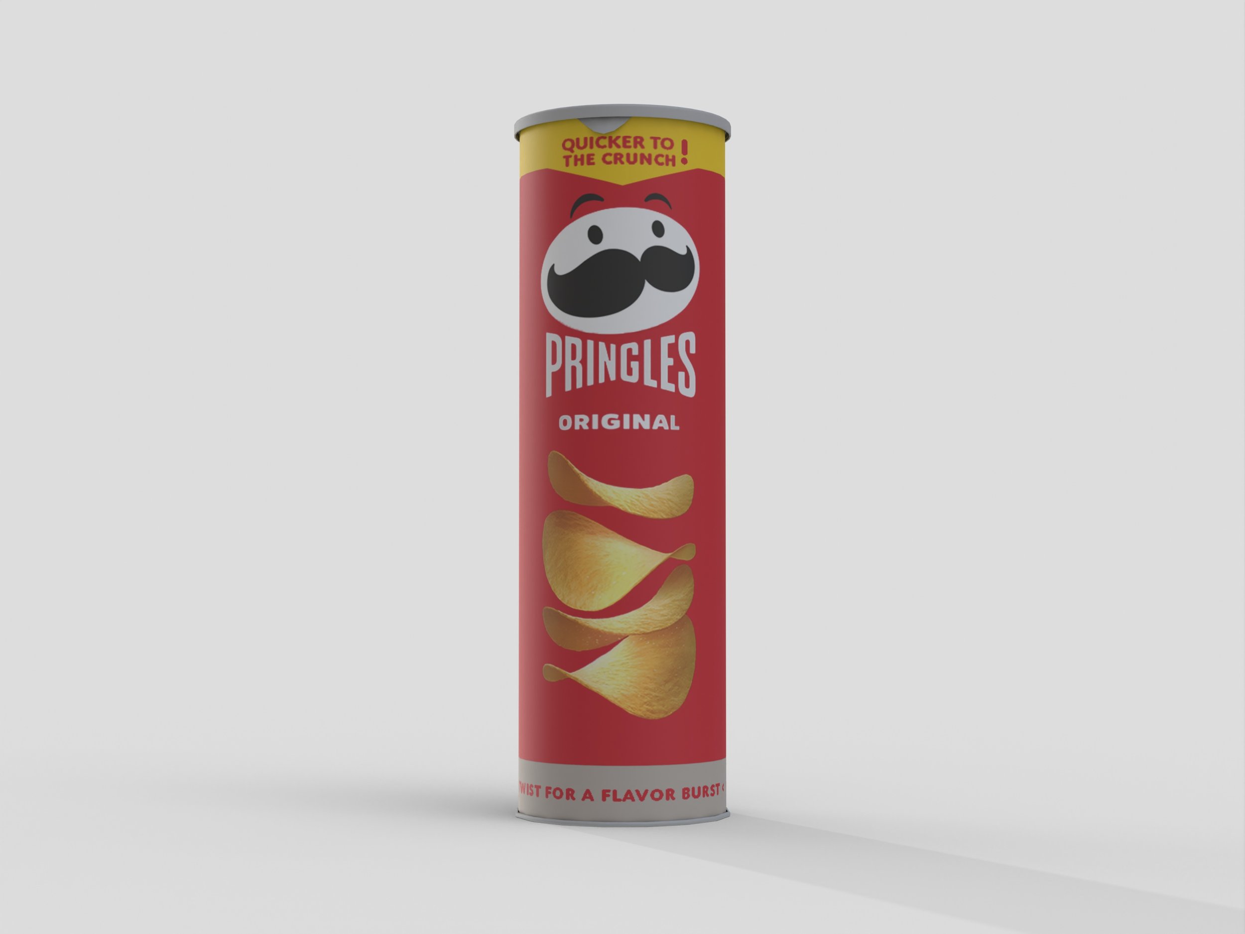
The Problem:
43% of Pringles consumers have had their hand wedged at the bottom of the snack brand's distinctive tube packaging while rummaging for the last shattered chips.
The Strategy:
Through replacing the metal bottom with a twist bottom (powered by manual rotation of the lower ring) to raise the height of the crisps.
This can simplify eating Pringles from the tube because consumers will be able to access the chips at the bottom of the can without having to turn it over to get to the rest of the chips.
Role:
Art Director/ Designer/ Creative Strategist
Software Used:
Adobe Illustrator, Adobe Photoshop, Adobe Premiere Pro