MELCHIORI’S APPLE JUICE
Melchiori:
Packaging Re-Design
Client:
The company Melchiori is located in the heart of the Italian Dolomites, a territory known for apples to grow and flourish with their own unique taste and freshness.
The Ask:
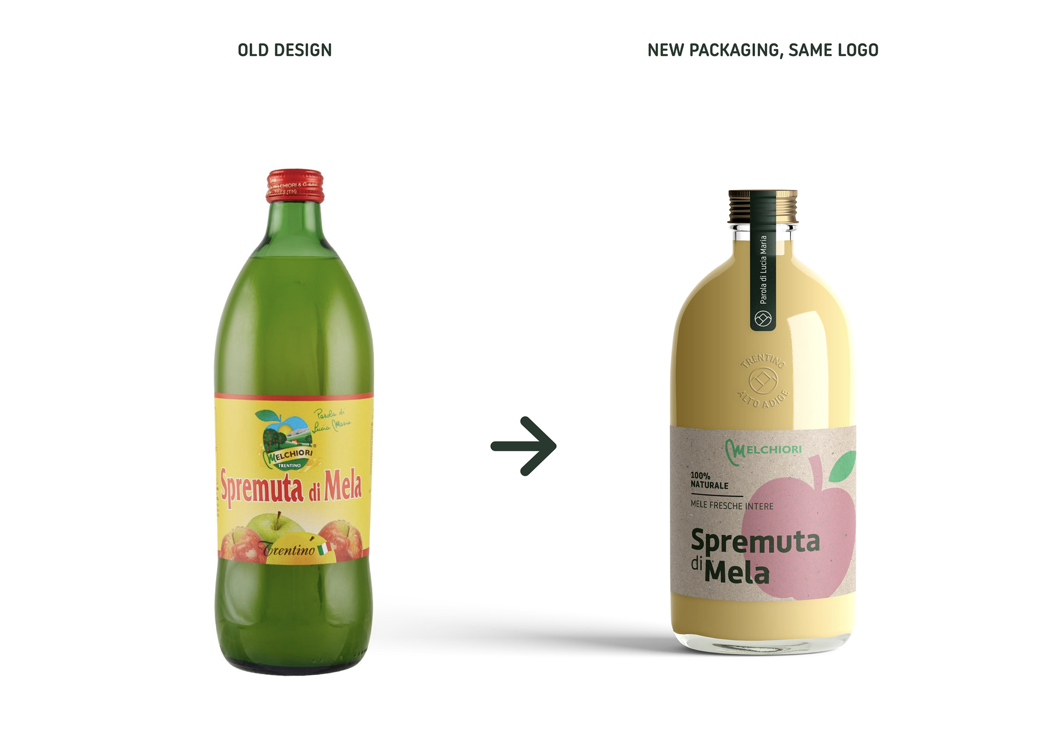
A brand new makeover, while still maintaining the same logo, and the ambition to stand out as a premium, fresh apple juice within the Italian and foreign supermarkets.
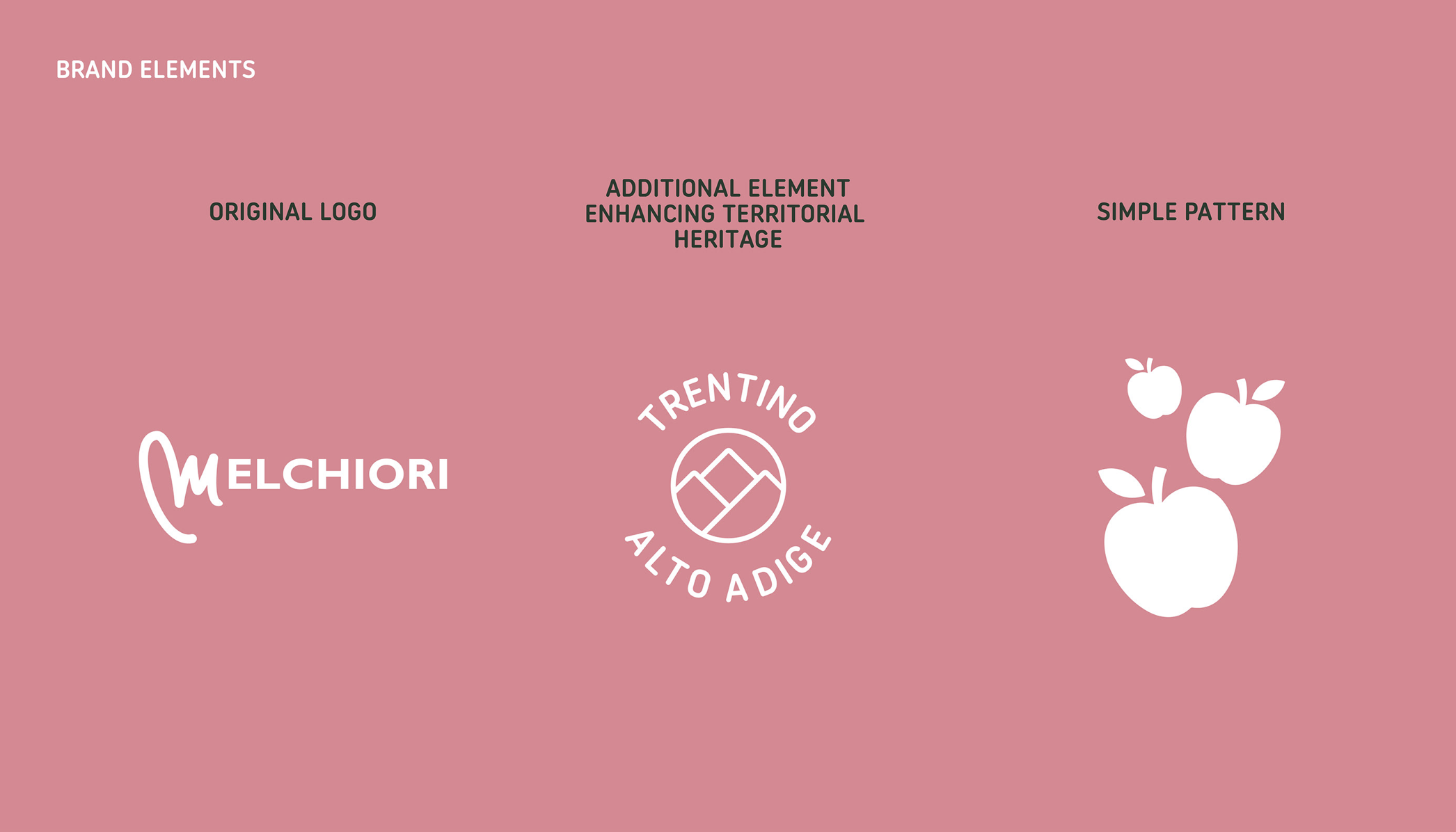
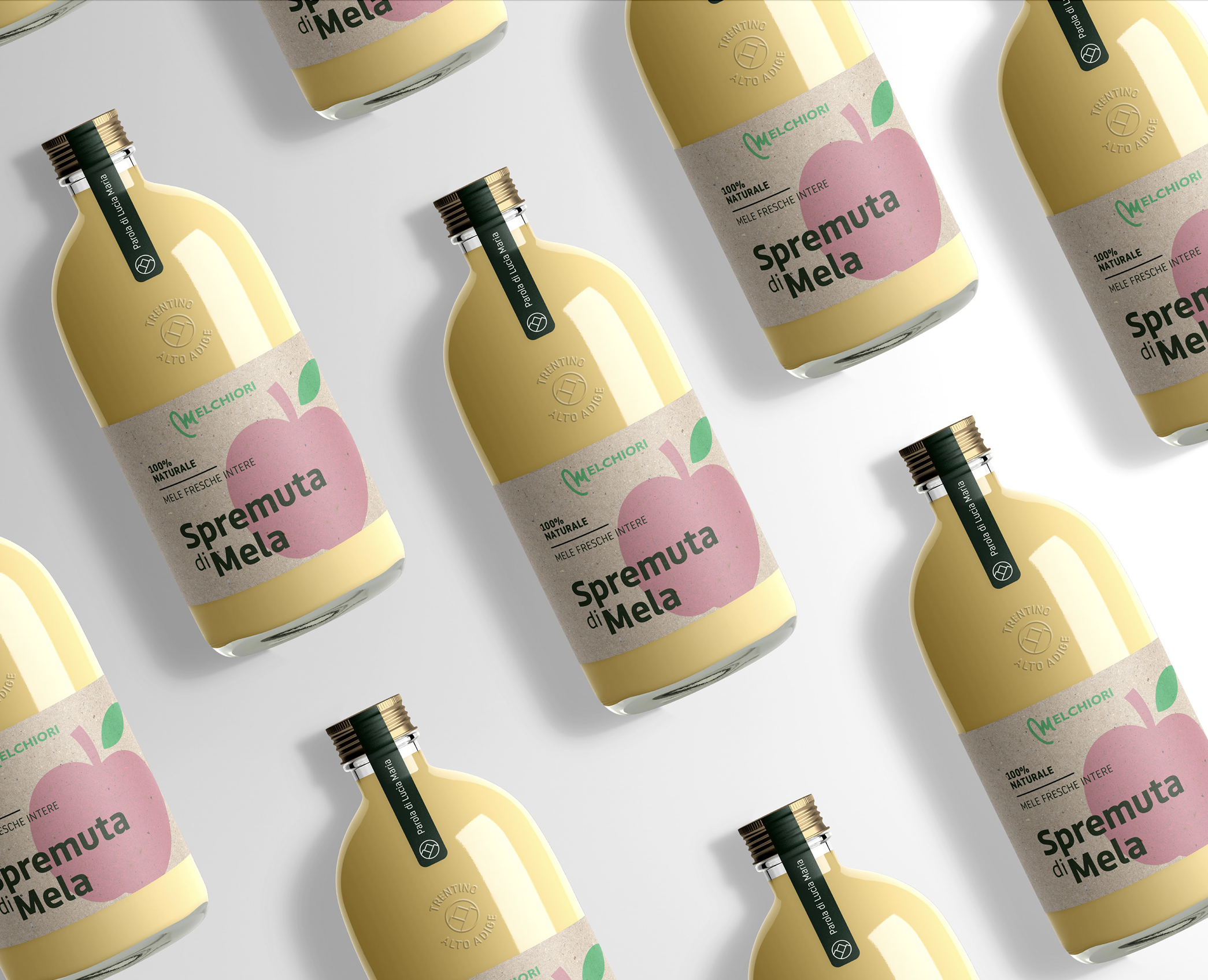
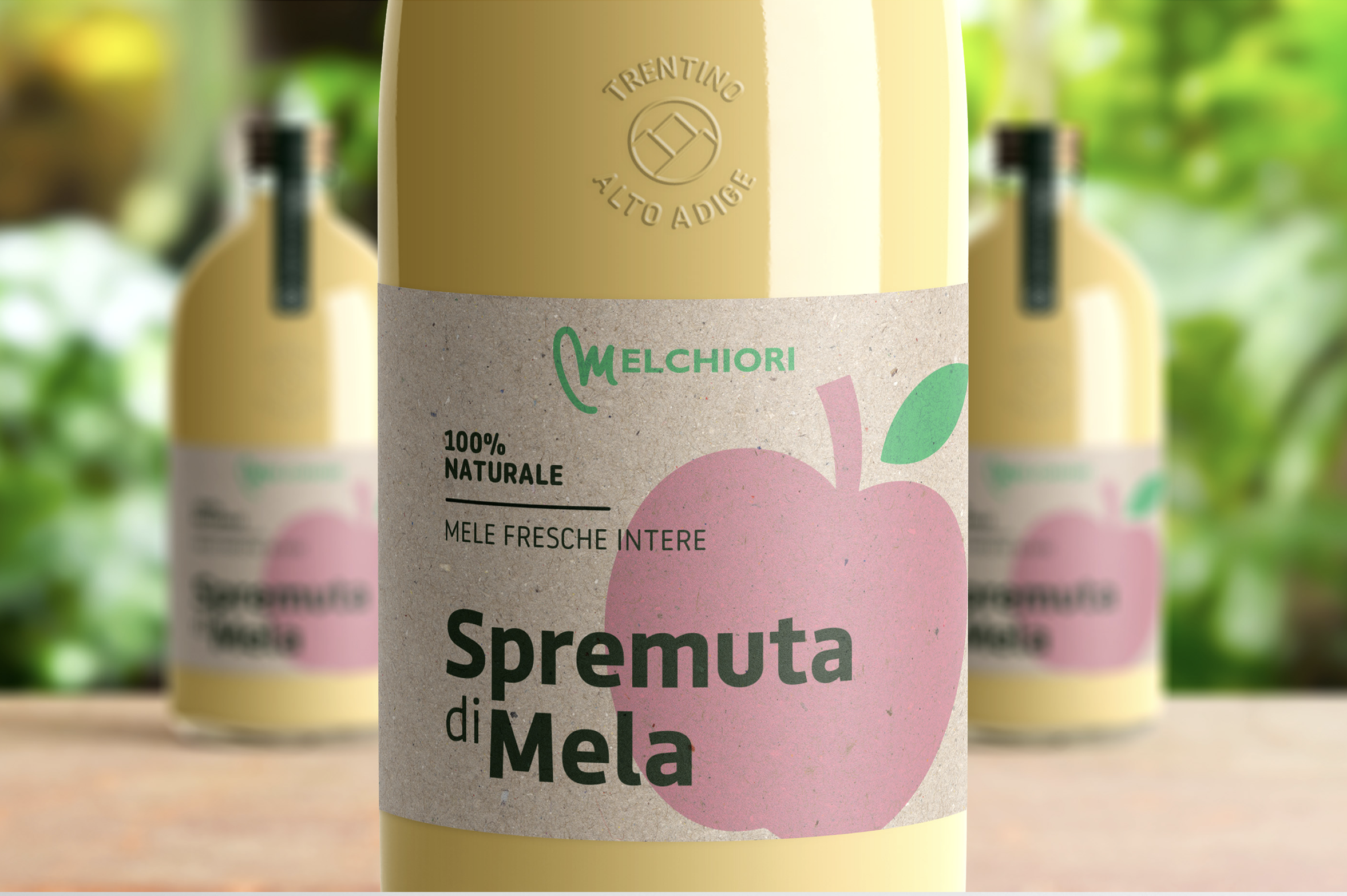
Melchiori's values lie in the territorial heritage of Trentino Alto Adige (IT), known for it's superior quality apples. They wish to convey the company's genuinity of craftman-ship, the search for raw materials and traditional territorial heritage.
Solution:
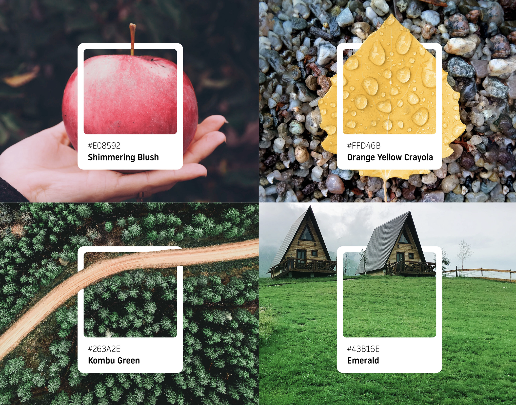
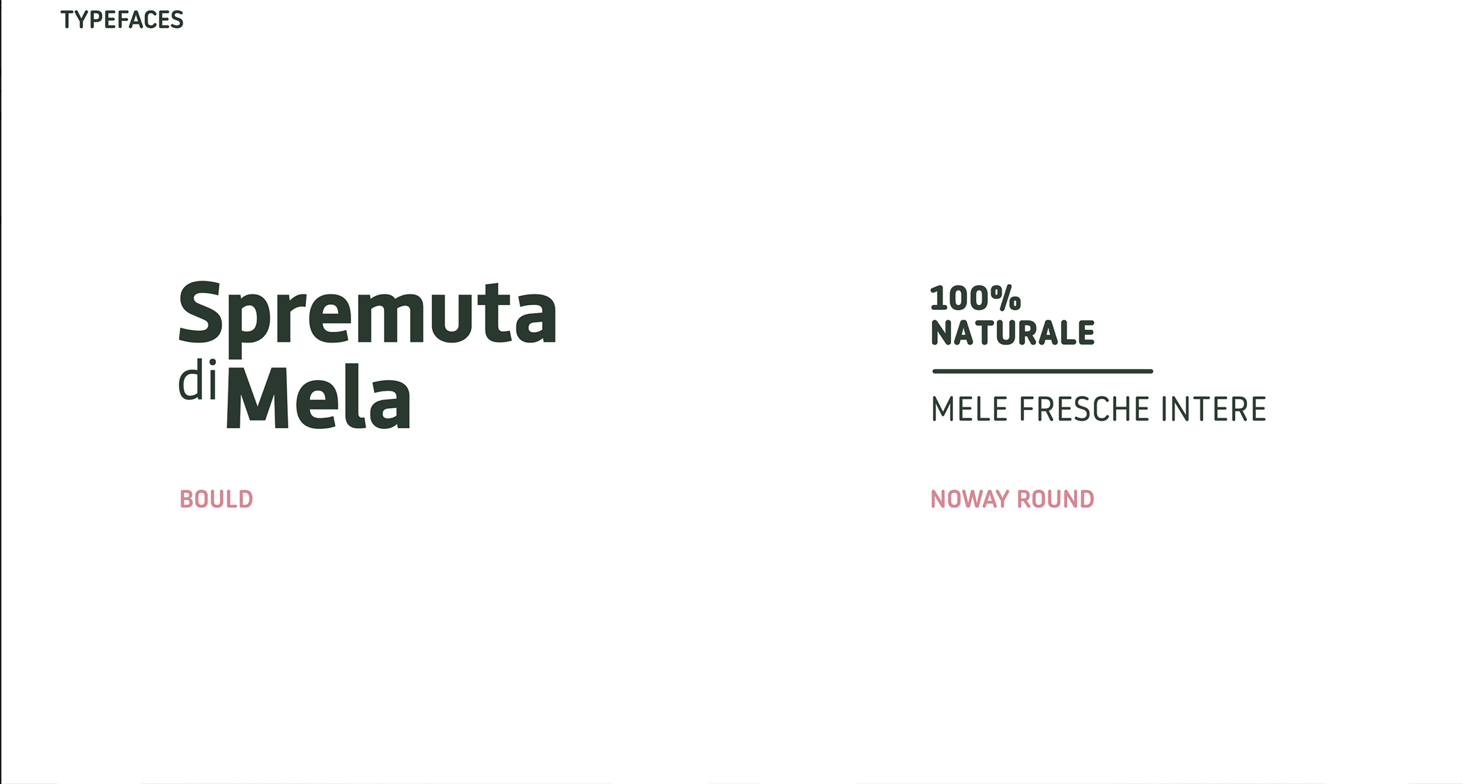
This was achieved through the modernization of the packaging, bottle design, and colors used. It uses simple and minimalistic elements, with a touch of premium, and along with the idea of home-made through the use of recycled paper as the label. This packaging redesign of Melchiori’s Apple Juice gives it a modern twist with strong connections to heritage and territory.
Role:
Art Director working with a designer & a Copywriter.